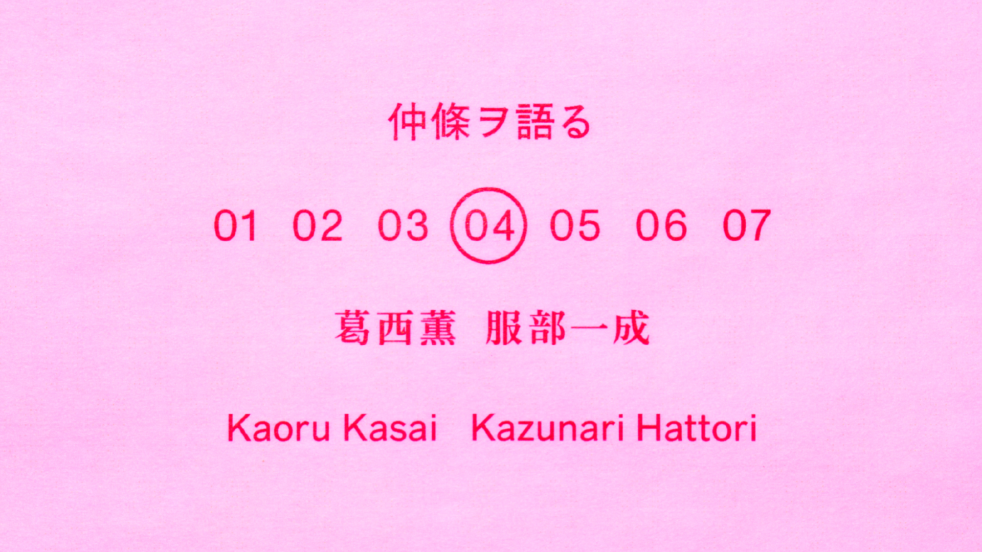
仲條ヲ語る#4
「資生堂が持つ「文化的なイメージ」を
つくり上げたのは仲條さんなのかもしれない。」
インタビュー・文/上條桂子
写真/細倉真弓
2026.3.31
資生堂ギャラリーで開催中の「うたう仲條 おどる仲條 -文字と画と、資生堂と」展と連動し、仲條正義氏とゆかりの深い人方々に、その仕事やまなざしについてうかがう連載「仲條ヲ語る」。
ともに過ごした時間、交わしたことば、現場での記憶——それぞれの視点から浮かび上がるのは、デザイナーとしての姿だけでなく、ひとりの人間としての仲條正義氏です。
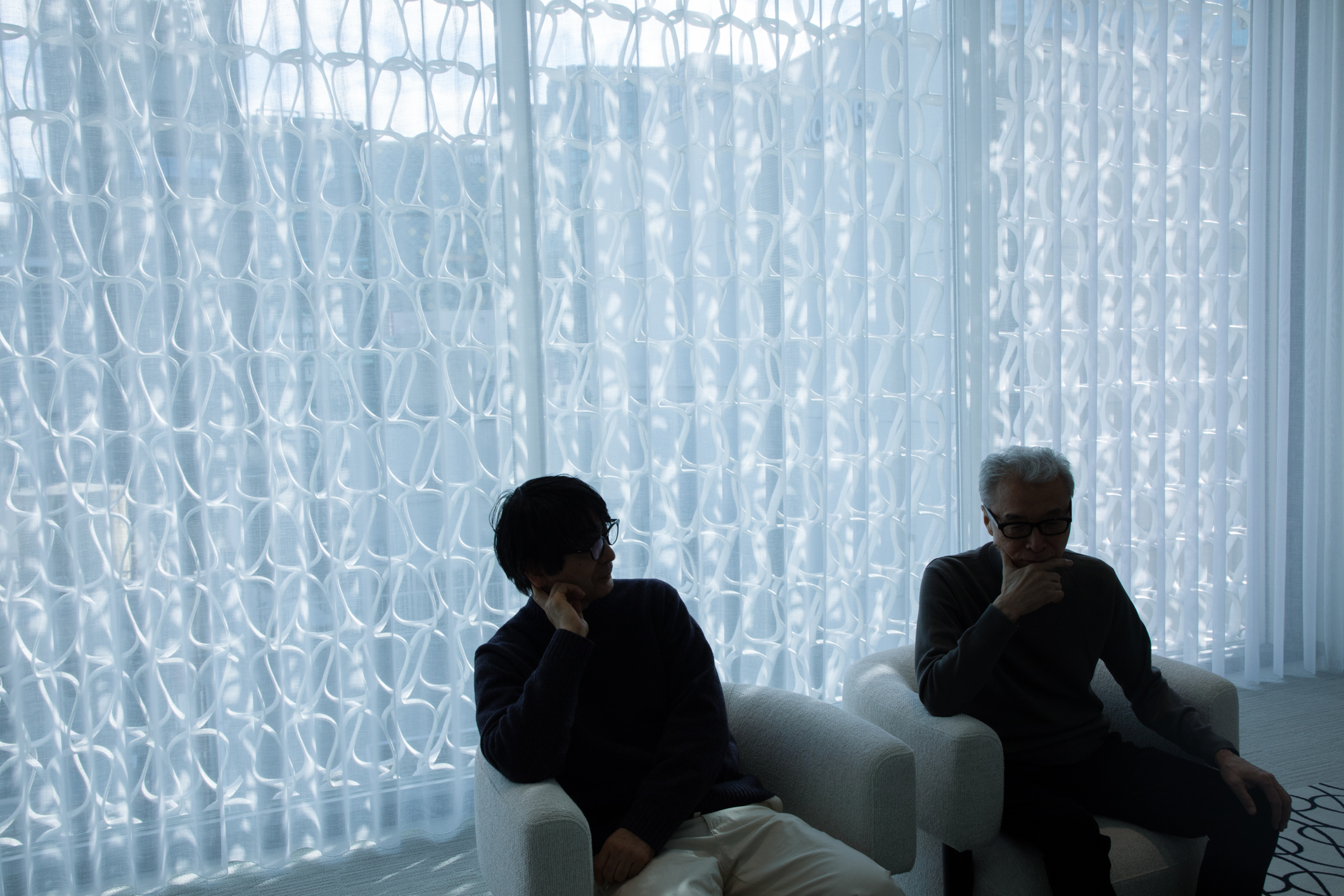
第4回は、葛西薫氏と服部一成氏。仲條正義氏と親交の深いお二人は、作品集『仲條 NAKAJO』(ADP)では編集委員も務めました。アートディレクションやグラフィックデザインの領域で、長く仕事を見つめ、ともに時代を歩んできたお二人。そのまなざしから、仲條デザイン、そして資生堂との関係をひもときます。
——お2人が仲條さんの仕事を意識的にご覧になったのは何時頃ですか?
葛西 最初に仲條さんの仕事を意識したのは『家庭画報』の扉絵(1974年)だったと思います。もうひとつ、「ザ・ギンザ(THE GINZA)」(1975年)ですね。格子柄に対してTHE GINZAの文字が絶妙に組み込まれているところに感動しました。
服部 僕は葛西さんより15歳下だから、仲條さんを知ったのは10代で見た『花椿』ですね。中学生の頃なので、70年代の終わりごろだと思う。姉が家に持って帰ってきていたのを見ていました。誌面に小さく名前が書いてあったけど、この人がどこまで担当しているのかはわからなかった。ザ・ギンザも家に包装紙があって、なんて素敵なんだと思った記憶が。当時の仲條さんはわりときっちりした文字やデザインで、今言われているような、強い個性のアーティスティックな感じとは違う印象だったと思います。
葛西 そうだねえ。活字もすごくスタンダードな使い方なんだけど、どこかアール・デコ的でもあり、仲條さん特有の匂いがある。THEとGINZAを2行に組んだロゴの場合、「I」の左右の字間が空いてしまうんだけど、かまわずグリッドを守って「T」と位置を揃えたり、格子の一定のリズムのなかに、ある意味では強引にロゴを組み込んでしまったり。自分のなかでなんらかのルールをつくって、理知的に処理している。
服部 その“冴え”がすごいですよね。誰でも使っている造形のパターンや文字組みの法則を利用しながら、少し組み替えたり、組み合わせたりして、ありそうでなかった新しいやり方をつくって、そんな手もあったかと気づかされる。そういう仲條式ルールみたいなものがいっぱいありましたよね。
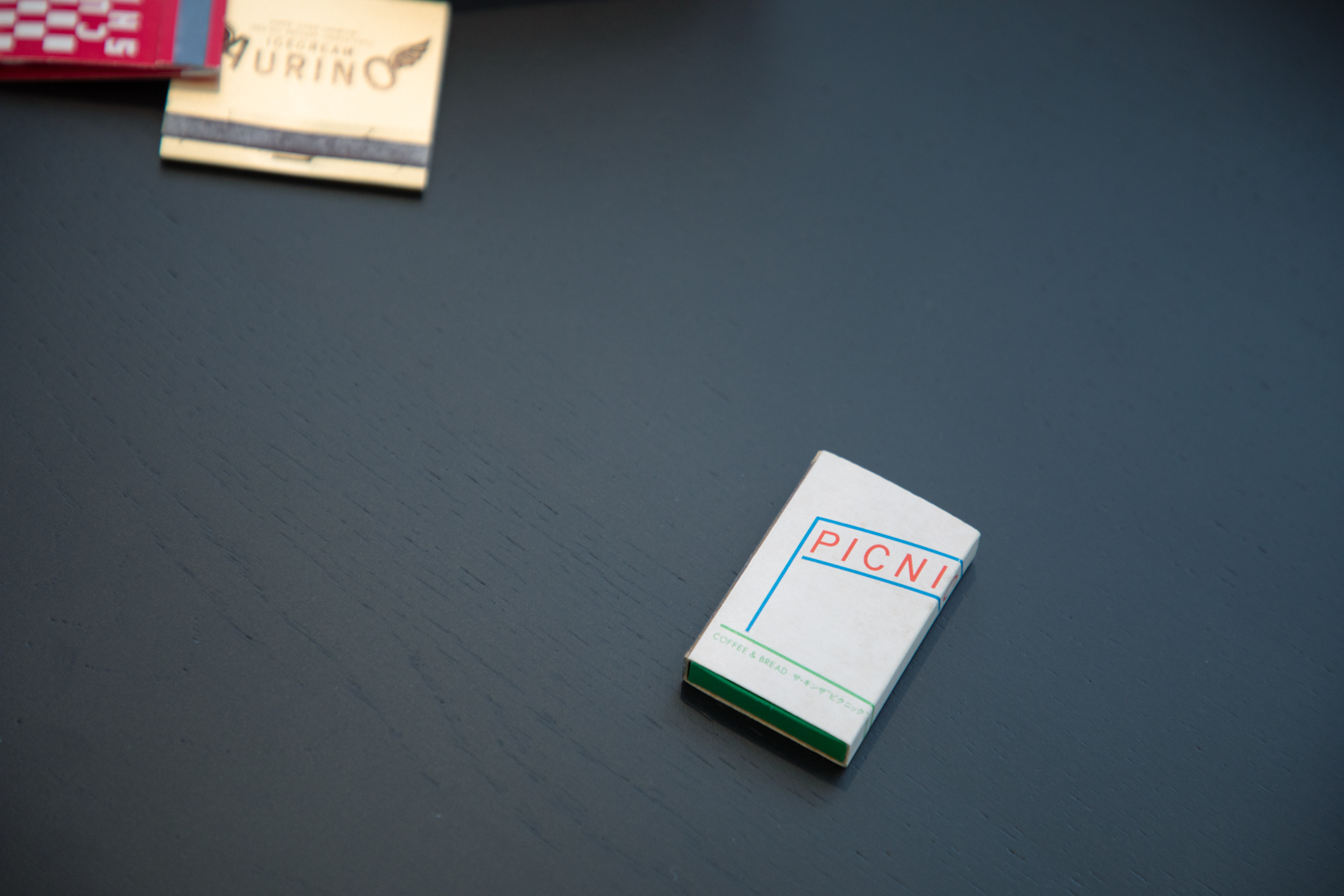
あともう一つ。(マッチを取り出し)当時、ザ・ギンザの地下に「PICNIC」という喫茶店があって、予備校の先生が連れていってくれました。内装とかまでは憶えていないんだけど、ザ・ギンザのロゴと雰囲気を合わせつつ、「C」だけが箱の側面に回り込んでいる。当時はデザインに憧れている予備校生ですから、こんなちょっとしたことにすごく感激していた。センチメンタリズムと共に手放せずにいるマッチですね。
葛西 僕がある仕事でまさに真似したのはね、この罫線の角がくっついてないところ。この隙間が実にいいんだよねえ。昔の活版印刷の名残を感じて。罫同士いうのは、表組みをするときに文字と同じように罫線にも土台があるから線と線がくっつかない。そういう活版印刷時代の記憶が思い出されてしまう。それは組版上の事情なんだけど、それも良しとしてデザインのアクセントにしてしまう。僕がそういう技術的なことに興味があるから、勝手に想像しているだけなのかもしれないけど(笑)。ザ・ギンザのショップに置いていた「タクティクス・デザイン」も好きだったな。これが出てきたのが83年か。
服部 『花椿』で表紙のデザインまでやるようになって、仲條さんカラーがどんどん強くなったのもその頃ですよね。82年から始まった海野弘さんの連載「旅をする女」の挿絵のシリーズも印象的でしたね。おそらく資料写真をもとにして、水彩画みたいな風景や人物を描いているものなんですが。僕がこの絵が好きだと話したら、「この絵はレイアウトの背景みたいに使って、上に写真を載せたりしちゃうから、人に頼むわけにもいかなかったんだよ」なんて言い訳のように言っていましたけど。たぶん人が描いても満足できないから、自分でやったってことだと思う。『花椿』を見ていると、実際には手の込んだことをいろいろやっていると思うんですが、出来上がりが重くならないで、パパっと片付けたみたいな軽さが出ていて。そこがまた恐ろしい(笑)。
葛西 でも仲條さんは、すごく気を遣う方でもあったから、僕からお願いしたセゾン生命の仕事とかは、多分苦しんでいたんだと思う。葛西が喜ぶのはどんな絵なのか、ものすごい量のスケッチを送ってきました。それがどれも良くて選べない……。よく「僕は広告ができない」って、いろいろな場所で口癖のように言っていたよね。そんなわけないのに。
服部 仲條さんと資生堂というと、社員時代は実質3年くらいで、主力の化粧品の仕事はそんなにされていなかったと思う。でも、ザ・ギンザや『花椿』もそうだけど、資生堂といった時に思い浮かべる「文化的なイメージ」は、いま考えたら仲條さんの仕事から受けている印象が多いなという気はします。葛西さんも『花椿』はご覧になっていました?
葛西 もちろん。回を重ねるほど各ページのデザインが自由自在になってきて、驚いてばかりでした。類型がまったくない。なかでも一番驚いたのは写真のディレクションですよね。今まで見てきたファッション写真と全く違う。人の起用の仕方もそうだし、とにかくすごいなと思いました。平気で写真をグラフィックの一部としても扱ったり。あのコラージュな気分て言うのかなあ。一緒に仕事をしている写真家や衣裳の人たちもみんなお祭りのように楽しんでいる感じが伝わってきて。実際に同行したスタッフが「仲條さんとの撮影は面白過ぎて忘れられない」とよく言ってました。その自由さがデザインに表れているなあと。しかも、結果的にかっこいい。
写真と絵と文字が渾然一体となり、
唯一無二の新しさを生み出す『花椿』という雑誌
服部 『花椿』を見て、自分はデザイナーに憧れましたけど、それは写真とテキストとデザインが一体となった、何とも言えない面白いものがそこにあるという雑誌の魅力を、無意識に感じていたのかもと思います。どこにもない、新しい、面白いものをつくろうと仲條さんが動き回っていたのが、今はよくわかります。素晴らしい写真だけでは満足せずに、突然仲條さんの絵がバーンと挟まったり。クリスマス特集で「メリー」「クリスマス」という欧文だけみたいなページがあったでしょ。(87年12月)これだけで見開きなんだ、とびっくりしましたね。『花椿』のレイアウトは、一見ものすごく自由な印象を受けるんですけど、コラムのタイトルが全部きっちり同じ文字数×2行で組まれていたり、細かい情報ページの文章が全部、余りのないピッタリの文字数で組まれていたりして、そういう点はすごく緻密で厳しかったのだと思います。
葛西 『花椿』は、デザイナーとして「やっちゃいけないことだらけ」って感じがするんですよ。例えば、文字の周りを紙のギリギリのところで裁ち落とすような。僕なんか、崖から文字が落ちそうで落ち着かない(笑)。他にも、空きが均等で文字列の位置づけがパッと見よくわからないような組み方とか。もちろん読んでいる人は、見ればわかることなんだろうけど。僕にとっては恐ろしくてできないようなことが、『花椿』では平気で行われていました。
——世の中の動きをすごくよく見ていて、流行にもすごく敏感だった印象があります。
服部 普通に流行っているものを、いいよねって言ってることもよくありました。でも自分がつくるものとなると、仲條さんが培ってきたセンサーのなかで、これを今やったら終わりだろうとか、時代とぴったり合うものをつくっていても生き残れないとか、独特の判断があった。例えば資生堂パーラーのロゴにしても、後に仲條さんは「馬鹿げたロゴだから生き残ってんだよ」って。もちろん本当に馬鹿げては全然いなくて、でも発表当初はかなり違和感もあって、それが仲條さんならではの生命力になっている。
葛西 俗であることを好むようなところもありましたよね。正統への反逆でもなく、平気でそこに身を置いてしまうところもあって。「WORD」のロゴタイプとかも、普通に考えたら文字幅の広い「W」がいちばん大きくて、そこからだんだん小さくしていくのならわかるけど。まったく逆。一番息苦しい「W」なのに、結果的にすごく印象に残るロゴでもあって。そのあたりに何かの仲條さんの考えとか秘密があるんですね。
服部 gggの個展でつくった、青の上に白い修正液で描いた作品がありますね、水平線に「ニコニコ」って文字がある。あの絵はターナー(※イギリスを代表する19世紀の画家)を意識したって言っていて。美術史を見渡して、ターナーもいて、20世紀の終わりに自分が何を描くのか。本気でそれくらいの視点で考えていたようなところはありますね。デザインにしても、流行は横目で見つつも、今やるならどんなロゴをつくるか、写真を撮るかを考えていたと思う。本当に恐ろしい(笑)。「ニコニコ」の原画は小さいんですが、迫力はものすごかったですよ。普段はわざと安っぽく振る舞っているけど、寝ながらいろいろ考えているんだなと。
伝統、雑誌、資生堂……、
すべてに独自の解釈で向かい合う。
葛西 仲條さんはことばが素晴らしいですよね。ご自身もことばが好きだし。語呂合わせみたいなこととか、都々逸(どどいつ)みたいな感じとか。僕がポスターをつくらせてもらった仲條さんと服部さんのG8での二人展のタイトルを、小料理屋の座敷で一緒に考えたとき、すごく楽しかったね。そこにあった紙ナプキンにアイデアを書き出したりして。その場では「仲條服部銀座八丁目心中」に決まったんですよ。そうしたら翌々日だったかな、仲條さんから電話が来て、「タイトルから銀座を外そう」って。それで「仲條服部八丁目心中」になった。その後もずーっと仲條さんは考えていたんだなと(笑)。たしかにその方が語調がいい。さらにキャッチフレーズは「正義改心! 服部有頂天?」になり。そこに載せた仲條さんと服部さんの蒟蒻問答(こんにゃくもんどう)のようなやりとりもノリノリで実に面白かったねえ。
服部 『花椿』の特集タイトルも、これは仲條さんっぽいなっていうのがたくさんありましたよね。ある展覧会で仲條さんとトークをやったんですが、仲條さんの出品作は松の絵に「待つ」、菊の絵に「喜躯」とか書いてあって、僕が「仲條さんはいつもことばが冴えていますが、今回のは出来が今ひとつ甘いですよね?」って突っ込んでみたの。そうしたら、仲條さんがすかさず「それがいいんだよ!」って(笑)。それで全部ひっくり返っちゃって。「それがいいんだよ」はさすがだなって思いました。
葛西 かわしているわけでもなく、その場に呼応してしまう。仲條さんに一番言われたくないのは「退屈だね」って。仲條さんはいかにもそれ風なものを嫌うところがあったように思います。仲條さんのデザインを振り返ってみると、やっぱり日本というよりは異国的なイメージがあるかもなあ。
服部 初期のデザインはアメリカやヨーロッパですよね。急に日本のモチーフをやり出したと思った仕事があったんですよ。この富士山や桜をモチーフにしたポスター(「ザ・チョイス大賞展」1994年)は、強烈に印象に残っていますね。
この奇妙な能のポスター(「日比谷シティ 薪能」1981年)あるでしょ。原色で、いいのか悪いのかよくわからない。仲條さんは結構気に入っていて「俺はね、能ってのはこういうもんだろっていうのをやってやったんだよ」って言っていました。能のポスターといえば田中一光さんの名作がいくつもありますが、仲條さんは日本の美とか伝統の世界を描くというのとは全然違う角度でやろうとしている。仲條さんはデザインにおいて、例えば人がなんとなく抱いているや「能」とか「日本」らしさ、それが「資生堂」でも「資生堂パーラー」でもいいんだけど、そのイメージを「いや、本当は違うはずだ」ってずっと見極めるようなことをしているような。このポスターに関しては、まだ半分も飲み込めていないんだけど(笑)、なるほどなと。自分もデザイナーとしてそうありたいなと思いますね。僕らは親しくはさせてもらったけど、実は飲み込めてない部分がたくさんあるなあっていう感じがありますね。いつか分かるのかもしれない、これが。
葛西 分かってもらってたまるか感があるのかなあ。でもこのポスター見ていると若々しいねえ。「シティ」だけを黒ベタ白抜きにするとか。なんか、元気いっぱいなんですよ。細いところに色変えをしてみたり、横組みを入れてみたり、これは若さだなっていう気がする。デザインをゲームのように楽しんでいるような気もするね。
——仲條さんの仕事のなかでの資生堂の仕事というのは、どのような立ち位置だったと思われますか?
葛西 資生堂はこうあって欲しいみたいな願いというか、イメージが仲條さんの中にきっとあったんだと思います。
服部 具体的に資生堂の仕事は何が特別だったのか、それはわかりませんが、仲條さんからは資生堂への愛をすごく感じますよね。まずは銀座っていう街が仲條さんには特別で、銀座に縁があって、松屋銀座のロゴや他の仕事もいろいろあるし。その銀座の中に資生堂があるという。仕事に関しても、好きにやっているようにも見えるけど、資生堂が店をつくるならこうだろうとか、パーラーだったらどう見えるのがいいとかを、すごく考えていたんだと思います。社員としては3年しか在籍しなかったけど、そのあとの付き合いも長いし、独特なポジションですよね。やっぱり替えがきかない人だから資生堂の仕事が長く続いたんだろうし、他の人では務まらないことをやっちゃったから、その後が大変っていうか(笑)。普通のクライアントとデザイナーの関係とはやっぱり違う、理解というより独特の解釈っていうのかな。あと、それぞれの仕事で資生堂の中にキーマンがいて、仲條さんの能力を発揮させたり、開花させたりしたんだろうと想像します。仲條さんも、自分がいつまでも資生堂の一員みたいな感じでいることが、すごく居心地良さそうな感じがありました。
——仲條さんのデザインやお人柄から「東京」を感じる方も多くいます。江戸っ子というか。お2人は、仲條さんから感じる東京らしさみたいなものはありましたか?
葛西 僕は田舎から出てきて、仲條さんと少し話ができるようになってから、時々ご馳走をしてくれたり、一杯飲ませてくれたりしました。銀座にあるハワイアンしか流さないようなバーに突然連れていってくれたり。仲條さん自身が楽しみたいのと、プラス僕に、こういう時間を味わえよと言っていたような気もします。仲條さん行きつけの銀座の小さな焼鳥屋に連れていってくれた時は、ご自分は食べずに、僕が食べている姿を見て「うまそうに食べるねえ」と、うれしそうにしていました。僕は「もういい年なのに、お腹をすかせた子どもみたいで恥ずかしいです」って言ったんだけど(笑)。そんなとき、僕は今こうして仲條さんと一緒に東京にいるんだなあ…と、喜びをかみしめていました。
服部 あのね、仲條さんは葛西さんにものすごく優しいんですよ(笑)。他の人にはいつも厳しいことを言うし、それをお互いに愉しむようなところがあったんですが、葛西さんは別格。ひたすら甘い。葛西さんがいない席でおいしいものが出ると、「うまいね、葛西にも食わせたいね」ってよく言っていました。僕もかなり贔屓された方だと思うけど、でも厳しいこともしょっちゅう言われました。
葛西 温情っていうんですかね、何も知らない僕にもっと人生は楽しいことたくさんあるぞ、うまいものもあるぞっていうことを、お前が生きているうちにもうちょっと味わって欲しいと。口に出して言われたことはないけど、そんな感じはありましたね。僕から見ると、仲條さんと服部さんの関係はうらやましいなって思うんですよ。30歳の年の差がありながら、友人扱いで平気で言いたいことを言って。僕ももっと叱って欲しかったなっていう嫉妬もありますよ(笑)。
葛西薫
1949年北海道生まれ。1973年サン・アド入社。サントリーウイスキー、サントリーウーロン茶、ソニー、西武百貨店、ユナイテッドアローズ、虎屋などの広告制作およびアートディレクションのほか、映画演劇の宣伝制作、CIサイン計画、パッケージデザイン、ブックデザインなど多岐に活動。著書に『図録 葛西薫1968』(ADP)。仲條正義氏との交友は1985年頃にはじまり、2021年刊行の『仲條NAKAJO』(ADP)では編集委員を務めるなど、公私にわたり深い関係を築いた。
服部一成
1964年東京生まれ。1988年東京芸術大学美術学部デザイン科卒業。同年ライトパブリシティ入社。2001年よりフリーランス。主な仕事に、雑誌『流行通信』、『here and there』、『真夜中』のアートディレクション、三菱一号館美術館、新潟市美術館、弘前れんが倉庫美術館のロゴタイプとサインデザイン、旺文社『プチ・ロワイヤル仏和辞典』などの書籍デザインほか。2021年刊行の『仲條NAKAJO』(ADP)では編集委員および構成・デザインを務めるなど、仲條正義氏と深い関わりをもつ。
上條桂子
ライター/編集者
カルチャー、デザイン、アートについて編集執筆。展覧会の図録や書籍の編集も多く手がける。武蔵野美術大学非常勤講師。著書に『玩具とデザイン』(青幻舎)。近年担当した書籍に『北欧デザインの考え方 プロダクト、建築、テキスタイル 名作をつくった人と時代とアイデンティティ』(渡部千春著、誠文堂新光社)、『校正・校閲11の現場 こんなふうに読んでいる』(牟田都子著、アノニマスタジオ)がある。雑誌『BRUTUS』にて「韓国文化通信」の連載を担当。
https://www.instagram.com/keique
細倉 真弓
写真家。触覚的な視覚を軸に、身体や性、人と人工物、有機物と無機物など、移り変わっていく境界線を写真と映像で扱う。立命館大学文学部、及び日本大学芸術学部写真学科卒業。写真集に『LATE SUMMER NERVES』(2025年、dmp editions)『NEW SKIN』(2020年、MACK)、『Jubilee』(2017年、artbeat publishers)。
http://hosokuramayumi.com
-
仲條ヲ語る#3 「仲條正義流の「本歌取り」」
Talking about Nakajo #3 "Masayoshi Nakajo’s Art of “Honka-dori”"
-
仲條ヲ語る#2 「其ノ、ココロハ 小村雪岱×仲條正義」
Talking about Nakajo #2 "The Spirit Within: Komura Settai × Masayoshi Nakajo"
-
仲條ヲ語る#1 「デザインにも表れる根っからの東京人的気質」
Talking about Nakajo #1 "A fundamentally Tokyoite sensibility—even in design"
-
映画には思いや願いがつまっている
Movies are full of thoughts and wishes.
-
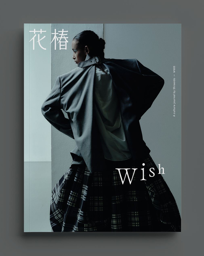
Hanatsubaki New Issue No.833
Hanatsubaki New Issue No.833
Talking about Nakajo #4 "Nakajo maybe the one who created the "cultural image" of Shiseido"
2026.3.31
Interview and Text / Keiko Kamijo
Photography / Mayumi Hosokura
In conjunction with the exhibition Nakajo Sings, Nakajo Dances—Letters, Pictures, and Shiseido, currently on view at the Shiseido Gallery, this interview series invites people closely connected to Masayoshi Nakajo to reflect on his work and perspective.
Through shared memories, exchanged words, and recollections from the field, what emerges is not only Nakajo the designer, but Nakajo the person.
For this fourth installment, we speak with designers Kaoru Kasai and Kazunari Hattori, both of whom shared a close relationship with Nakajo and served as editorial committee members for the monograph NAKAJO (ADP). Drawing on years of observing his work, they reflect on Nakajo’s design and his relationship with Shiseido.
—When did each of you first become consciously aware of Nakajo’s work?
Kasai:
I think the first time I became aware of Nakajo’s work was through the frontispiece illustrations he did for Kateigaho (1974).
And then there was The Ginza (1975). I was struck by how beautifully the words “THE GINZA” were integrated into that grid pattern.
Hattori:
I’m fifteen years younger than Kasai, so I first encountered Nakajo through Hanatsubaki, which I saw as a teenager.
I must have been in junior high school, so it would have been the late 1970s. My older sister used to bring the magazine home. His name appeared in small print, but at the time I had no idea how much of the magazine he was responsible for.
We also had The Ginza wrapping paper at home, and I remember thinking how beautiful it was.
Back then, Nakajo’s work felt quite precise—carefully set typography and design. It gave a different impression from the strong, highly individual, almost artistic style he is often associated with today.
Kasai:
Yes, exactly. The typography is very standard in its use, but at the same time there’s something almost Art Deco about it—something distinctly Nakajo.
Take the logo where “THE” and “GINZA” are set across two lines. The spacing around the “I” tends to open up awkwardly, but he doesn’t try to correct it. Instead, he aligns it with the “T” and maintains the grid.
Or he forces the logo into the fixed rhythm of the lattice pattern—almost aggressively.
It’s as if he establishes a set of internal rules and processes everything with a kind of intellectual clarity.
Hattori:
That sharpness is remarkable.
He takes familiar compositional patterns and typographic rules—things everyone uses—and slightly rearranges or recombines them to create something new. It feels like something that could have existed, but didn’t—until you see it and think, of course, that’s another way to do it.
There were so many of these “Nakajo-style rules,” weren’t there?
Hattori:
And one more thing. (He takes out a matchbox.)
Back then, there was a café called PICNIC in the basement of The Ginza. One of my prep school teachers took me there.
I don’t remember the interior very clearly, but the design matched the atmosphere of The Ginza logo, and only the “C” wrapped around onto the side of the box.
At the time, I was a student aspiring to become a designer, so even something this small made a strong impression on me.
I’ve held onto this matchbox ever since—partly out of sentiment.
Kasai:
There’s something I directly borrowed in one of my own projects—the way these rule lines don’t quite meet at the corners.
That tiny gap is really beautiful. It evokes the legacy of letterpress printing.
In traditional typesetting, the lines don’t fully connect because, like letters, they sit on individual blocks. That technical limitation creates a gap.
It’s a constraint of the printing process, but Nakajo embraces it—and turns it into a design accent.
Maybe I’m just imagining this because I’m interested in those technical aspects (laughs), but that’s how it feels to me.
I also loved the Tactics Design pieces that were sold at The Ginza shop. That must have been around 1983.
Hattori:
It was around the time Nakajo began designing the covers for Hanatsubaki that his distinctive style really started to come through more strongly.
I also remember the illustrations for Hiroshi Unno’s series Travelling Women, which began in 1982. They seemed to be based on reference photographs, but rendered as watercolour-like scenes of landscapes and figures.
When I told Nakajo I liked those drawings, he said something like, “I was using them almost like backgrounds for layouts, placing photographs on top, so I couldn’t really ask someone else to do them.” It sounded like an excuse—but I think in truth he did them himself because he wouldn’t have been satisfied with anyone else’s work.
When you look at Hanatsubaki, you realise how intricate and carefully constructed it actually is. And yet the finished result never feels heavy—it has this lightness, as if it were all done in a single, effortless gesture. That’s what makes it almost frightening (laughs).
Kasai:
At the same time, Nakajo was also very considerate. When I asked him to do work for Saison Life Insurance, I think he really struggled with it.
He sent me an enormous number of sketches, trying to figure out what kind of image I would respond to. And they were all so good—I couldn’t choose.
He used to say, almost like a habit, “I’m not good at advertising.” Which, of course, wasn’t true at all.
Hattori:
When you think of Nakajo and Shiseido, his time there as an employee was actually quite short—only about three years. And he wasn’t directly involved in many of the company’s core cosmetics campaigns.
But when you think about Shiseido today—the kind of “cultural image” it evokes—I feel that much of that impression comes from Nakajo’s work, whether through The Ginza or Hanatsubaki.
Kasai, did you also follow Hanatsubaki?
Kasai:
Of course. With each issue, the design of the pages became more and more free, and I was constantly amazed.
There was no fixed pattern at all.
What impressed me most, though, was the direction of the photography. It was completely different from any fashion photography I had seen before.
The way people were cast, the way images were used—it was extraordinary. Photographs could be treated simply as elements within a graphic composition.
There was this sense of collage—almost like a festival. You could feel that the photographers and stylists working on it were genuinely enjoying themselves.
I’ve often heard people who were on those shoots say, “Working with Nakajo was so much fun, it’s unforgettable.”
That sense of freedom really comes through in the design.
And in the end, it always looks incredibly good.
(小見出し)
Photography, illustration, and typography merge into one—
Hanatsubaki as a magazine that created something entirely new
Hattori:
When I first saw Hanatsubaki, it made me want to become a designer.
Looking back, I think what I was responding to—perhaps unconsciously—was the way photography, text, and design came together into something that felt completely new and fascinating.
Now I can see clearly how Nakajo was constantly moving, searching for ways to create something that didn’t exist yet.
Even when the photography itself was already outstanding, that wasn’t enough for him—suddenly one of his drawings would appear, interrupting the flow.
There was also that Christmas feature—just the words “Merry” and “Christmas” across a spread (December 1987). I remember being amazed that a double-page spread could consist of just that.
At first glance, Hanatsubaki’s layouts feel extremely free. But in reality, they were incredibly precise. Column titles were always set in exactly the same number of characters, across two lines. Even the dense informational pages were composed so that the text fit perfectly, without any leftover space.
In that sense, it was actually very strict, very controlled.
Kasai:
For me, Hanatsubaki feels like a magazine full of things that designers are “not supposed to do.”
For example, text being cut right at the edge of the page. Personally, I’d feel like the letters might fall off the cliff—I’d be too uneasy to do that (laughs).
Or the way spacing isn’t evenly distributed, making it hard at first glance to grasp the positioning of the text.
Of course, readers can still understand it perfectly well. But for me, those are things that feel almost too risky to attempt.
And yet in Hanatsubaki, they were done without hesitation.
—He seemed to observe the world very closely and was highly sensitive to trends.
Hattori:
He would often say, quite simply, “This is good,” about things that were trending.
But when it came to his own work, he had a very particular way of judging things—based on a kind of internal sensor he had developed.
He knew that if he followed something too directly, it would be over. Even if you made something that perfectly matched the moment, it wouldn’t last.
Take the Shiseido Parlour logo, for example. Later he said, “It survives because it’s a ridiculous logo.”
Of course, it’s not actually ridiculous at all. But when it first appeared, there was a sense of discomfort. And that tension became part of its lasting vitality.
Kasai:
He also had a certain fondness for the vulgar, in a way.
Not as a rebellion against orthodoxy—but more like he could inhabit it without hesitation.
Take the logotype for WORD. Normally, you’d expect the wide “W” to be the largest letter, gradually decreasing in size.
But he does the opposite.
The most constricted letter is the “W,” and yet the result is incredibly memorable.
There’s something in that—some underlying logic or secret of Nakajo’s.
Hattori:
There’s also that work he showed at his exhibition at ggg—white correction fluid on a blue ground, with the word “nikoniko” on the horizon.
He said he was thinking of Turner—the 19th-century British painter.
It shows how he looked across the whole of art history—seeing Turner there, and then asking himself what he should create at the end of the twentieth century.
I think he really operated on that level.
Even in design, while keeping an eye on trends, he was always asking: What kind of logo should I make now? What kind of photograph should I take?
It’s quite terrifying (laughs).
The original nikoniko drawing is actually quite small, but its presence is overwhelming.
On the surface, he might appear deliberately casual, even a bit cheap—but behind that, he was constantly thinking, even while lying down.
(小見出し)
Tradition, magazines, Shiseido—
approached through Nakajo’s own unique interpretation
Kasai:
Nakajo had a wonderful way with words. He clearly loved language—wordplay, rhythmic phrasing, almost like dodoitsu verses.
When we were coming up with the title for the two-person exhibition by Nakajo and Hattori at ggg—the poster I designed—we sat together in a small Japanese restaurant and brainstormed ideas. It was great fun. We were scribbling ideas on paper napkins.
At first, we settled on Nakajo Hattori Ginza Hatchōme Shinjū. But a couple of days later, Nakajo called and said, “Let’s take ‘Ginza’ out of the title.” So it became Nakajo Hattori Hatchōme Shinjū.
He must have kept thinking about it (laughs). And he was right—the phrasing was much better that way.
The tagline also evolved into something like, “Justice Repents! Hattori in Ecstasy?”
And the exchange between Nakajo and Hattori that we included—almost like a nonsensical back-and-forth—had such great energy. It was really enjoyable.
Hattori:
There were so many feature titles in Hanatsubaki that felt unmistakably “Nakajo.”
I once did a talk with him at an exhibition, and his works on display included things like a painting of a pine tree with the word “wait” written on it, or a chrysanthemum with the characters “joy-body.”
I tried teasing him a bit and said, “Your wordplay is usually so sharp, but this time it feels a little weak, doesn’t it?”
And he immediately replied, “That’s exactly why it’s good!” (laughs)
That one line completely overturned everything. I remember thinking—that’s so like him.
Kasai:
It wasn’t that he was dodging the question—he was responding instinctively, in the moment.
The one thing you never wanted Nakajo to say about your work was, “It’s boring.”
He seemed to dislike anything that felt too predictable or too much like what it was supposed to be.
Looking back, his design doesn’t feel particularly “Japanese” to me—it actually has a kind of foreign quality.
Hattori:
His early work was very much influenced by America and Europe. Then there was a moment when he suddenly began using Japanese motifs.
There’s that poster with Mt. Fuji and cherry blossoms (The Choice Grand Prize Exhibition, 1994)—it left a strong impression on me.
And then there’s that strange Noh theatre poster (Hibiya City Takigi Noh, 1981). It uses primary colours, and it’s hard to tell whether it’s good or not.
Nakajo himself seemed to like it. He once said, “I wanted to show what Noh really is, in my own way.”
There are many masterpieces of Noh posters by Ikko Tanaka, but Nakajo approached the subject from a completely different angle.
Rather than simply depicting Japanese beauty or tradition, it’s as if he was constantly questioning those very images—what people assume “Noh,” “Japan,” or even “Shiseido” to be.
As if to say: That’s not actually what it is.
I still don’t feel like I fully understand this poster (laughs), but it makes sense in its own way.
As a designer, I aspire to approach things like that. Even though we were close to him, there are still so many aspects of his work that I feel we haven’t fully grasped.
Maybe one day we will.
Kasai:
Maybe he didn’t want to be fully understood (laughs).
But when I look at that poster, it feels very youthful.
For example, rendering just the word “CITY” as white on a black ground—it’s so energetic.
There are all these small decisions: shifting colours in narrow areas, introducing horizontal typesetting… it feels like the work of someone young.
It’s almost as if he’s treating design like a game—enjoying it.
—What kind of position do you think Shiseido occupied within Nakajo’s body of work?
Kasai:
I think Nakajo must have had a very clear image—almost a wish—of what Shiseido should be.
Hattori:
It’s hard to say exactly what made his work for Shiseido special. But you can really feel his affection for the company.
For him, Ginza itself was a special place. He had strong ties to it—there’s the Matsuya Ginza logo and various other projects. And within Ginza, there’s Shiseido.
Even in his work, which can sometimes look very free, I think he was always considering things carefully—what a Shiseido store should look like, what would be appropriate for Shiseido Parlour.
He was only officially employed there for three years, but his relationship with the company continued for much longer. It’s quite a unique position.
He was irreplaceable—that’s why his work with Shiseido lasted so long. And perhaps because he did things no one else could, it made things difficult for those who came after (laughs).
It’s not quite a typical client–designer relationship. Rather than simple understanding, it was more like a shared, distinctive interpretation.
And within Shiseido, there were always key individuals who enabled Nakajo’s abilities to flourish.
Nakajo himself also seemed very comfortable, almost as if he remained part of Shiseido even long after leaving.
—Many people sense a kind of “Tokyo-ness” in Nakajo—something like an Edo sensibility. Did either of you feel that as well?
Kasai:
I came to Tokyo from the countryside, and once I started talking with Nakajo more, he would sometimes treat me to meals or take me out for drinks.
He would suddenly bring me to a bar in Ginza that only played Hawaiian music. I think he wanted to enjoy himself, of course—but also to show me what that kind of time could be like.
Once he took me to a small yakitori place he frequented in Ginza. He didn’t eat anything himself—he just watched me eat and said, “You really enjoy your food.”
I felt a bit embarrassed, like a hungry child, even though I was already an adult (laughs).
But in those moments, I would think—I’m here in Tokyo, with Nakajo. And I would feel a deep sense of happiness.
Hattori:
You know, Nakajo was incredibly kind to Kasai (laughs).
With others, he could be quite strict—and there was a sense that both sides enjoyed that tension—but Kasai was an exception. He was always gentle with him.
If something delicious was served when Kasai wasn’t there, Nakajo would often say, “This is good—we should have Kasai try this too.”
I think I was also quite favoured by him, but he was strict with me as well. He would often say sharp things.
Kasai:
I suppose it was a kind of generosity.
Even without saying it directly, I felt that he wanted me to experience more of life—to enjoy good things, good food—while I still could.
From my perspective, I’ve always envied the relationship between Nakajo and Hattori. Even with a thirty-year age difference, they spoke to each other like equals, saying whatever they wanted.
To be honest, there’s a part of me that wishes he had scolded me more (laughs).
Kaoru Kasai
Born in Hokkaido in 1949. Joined Sun-Ad in 1973.
His work spans advertising production and art direction for clients including Suntory (whisky and oolong tea), Sony, Seibu Department Stores, United Arrows, and Toraya. He has also been involved in film and theatre publicity, corporate identity and signage systems, packaging, and book design.
His publications include Kaoru Kasai 1968 (ADP). His relationship with Masayoshi Nakajo began around 1985, and extended both professionally and personally over many years. In 2021, he served as a member of the editorial committee for NAKAJO (ADP).
Kazunari Hattori
Born in Tokyo in 1964. Graduated from the Department of Design at Tokyo University of the Arts in 1988, and joined Light Publicity the same year. Became independent in 2001.
His work includes art direction for magazines such as Ryuko Tsushin, here and there, and Mayonaka, as well as logotype and signage design for institutions including the Mitsubishi Ichigokan Museum, the Niigata City Art Museum, and the Hirosaki Museum of Contemporary Art. He has also worked extensively in book design, including the Petit Royal French–Japanese Dictionary (Obunsha).
In 2021, he served as both editorial committee member and designer for NAKAJO (ADP), reflecting his long-standing relationship with Masayoshi Nakajo.
Keiko Kamijo
Writer / Editor
Writes and edits on culture, design, and art. She has also edited numerous exhibition catalogues and books. Part-time lecturer at Musashino Art University. Author of Toys and Design (Seigensha).
Recent editorial projects include Perspectives on Nordic Design: The People, Eras, and Identities Behind Iconic Works in Product Design, Architecture, and Textiles by Chiharu Watanabe (Seibundo Shinkosha), and Eleven Sites of Proofreading and Copyediting: How We Read Texts by Miyako Muta (Anonym Studio).
She writes the column “Korean Culture Correspondence” for BRUTUS.
https://www.instagram.com/keique
Mayumi Hosokura
Photographer.
Working with a tactile visual sensibility, she explores shifting boundaries—between body and sexuality, human and artificial, organic and inorganic—through photography and video.
She graduated from the College of Letters at Ritsumeikan University and from the Department of Photography at Nihon University College of Art.
Her photobooks include LATE SUMMER NERVES (2025, dmp editions), NEW SKIN (2020, MACK), and Jubilee (2017, artbeat publishers).
http://hosokuramayumi.com