資生堂ギャラリーで開催中の「うたう仲條 おどる仲條 -文字と画と、資生堂と」展と連動し、仲條正義氏とゆかりの深い人方々に、その仕事やまなざしについてうかがう連載「仲條ヲ語る」。
ともに過ごした時間、交わしたことば、現場での記憶——それぞれの視点から浮かび上がるのは、デザイナーとしての姿だけでなく、ひとりの人間としての仲條正義氏です。
第5回は、グラフィックデザイナーの山口崇多氏。今回の展覧会では、仲條正義氏の作品をもとにしたモーショングラフィックスによる映像作品を手がけました。他者のグラフィックやイラストレーションを動かすというはじめての試みを通して見えてきた、仲條作品の動き、ことば、そしてデザインのあり方についてうかがいました。
ものがたりではなく、世界観としてのストーリー
——今回の映像作品の依頼を受けて、どんな感想からスタートしましたか?
最初はメールで「映像をつくりましょう」というお話をいただいて、打ち合わせを重ねるなかで、仲條さんの作品をベースにした映像をつくるという流れになっていきました。自分以外の人が描いたグラフィックやイラストレーションを素材として動かすというのは、今回がはじめてだったと思います。最初はかなりプレッシャーがありましたが、実際に始まってみると、思っていたよりプレッシャーを感じなかった。あまり感じないようにしていた、というのもあるかもしれません。仲條さんの作品であることはちゃんとわかる。それでいて、映像として時間のなかで展開されることで、作品をただ目で追うのとはまた違う体験になっている。そういうバランスになればいいなと思っていました。
——映像をつくるうえで、どのような構成を考えていたのでしょうか。
最初は、ちゃんとストーリーをつくって構成するべきなのか、それともいろいろな作品をミックスしていくような方法がいいのか、少し考えました。最終的には、後者に近いです。コラージュというか、DJみたいな感じですね。ひとつのものがたりとしてのストーリーを伝えるというより、世界観としてのストーリーを伝える。そういう感覚を大事にしました。
ですので、全体のミックス感や間の取り方に注目してほしいですね。少しだけ異質なものが入ってきたり、動きが少し変になったりするところがある。そういうちょっとした違和感があると思います。仲條さんの作品には、人を笑顔にさせるところがあると思うんです。だから今回も、ただかっこよく動かすというよりは、なんだか可笑しい部分、不思議な部分を大事にしました。意味があるようで、はっきりした意味があるわけではない。でも、その「ん?」という感覚を、わざとらしくなく入れていくことは、自分の制作のなかでもかなり大事にしている部分です。
——仲條さんの作品を動かすとき、直感で思いつく部分と、悩む部分はありました?
ほとんどすぐ思いつきましたね。画を見ていると、自然と「こう動くだろうな」というのが見えてくるんです。「うたう仲條 おどる仲條」というタイトルと同じで、見ていると動きが想像できる。そこは、仲條さんの表現そのものが持っている印象なのだと思います。
仲條さんの作品は、人間や動物、花といった、生きているもののモチーフが多い。飛行機なら飛ぶだろうし、動物なら動くだろうし、花にもなにか動きがある。それから、重層的にレイヤーが積み重なっているというより、一枚の絵のなかに要素がある。パーツがあるから、動かし方を想像しやすいんです。手で切ってコラージュして作品をつくっていたという話がありますが、ふだんの作品にもそういう感じがあって、一枚の画面のなかにそれぞれの要素が収まっている。だから映像にするときにも、自然に分けて考えることができました。
逆に悩んだのは、全体の構成ですね。どの作品もわりと均等によく見えるように、淡々とつくっていったんです。ただ、それが全体を通して単調になってしまうんじゃないかという不安は、最後までありました。でも最終的には、「あ、もう終わったんだ」という感覚でいいのかなと思えました。
仲條さんの作品も、ドラマチックな展開というよりは、淡々と好きなものを詰め込んでいる感じがある。『花椿』の特集も、起承転結でドラマチックに見せるというよりは、フラットですよね。だから今回の映像も、盛り上がりをつくらなくてよかったのだと思います。無意識のうちにそのフラットさは、仲條さんの作品とつながっていたのかもしれません。
(撮影:加藤健)
ことばと画が、同じ画面で生きている
——仲條さんはことばにも力がありますよね。
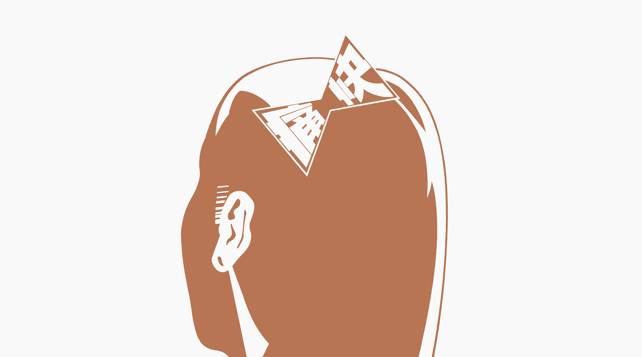
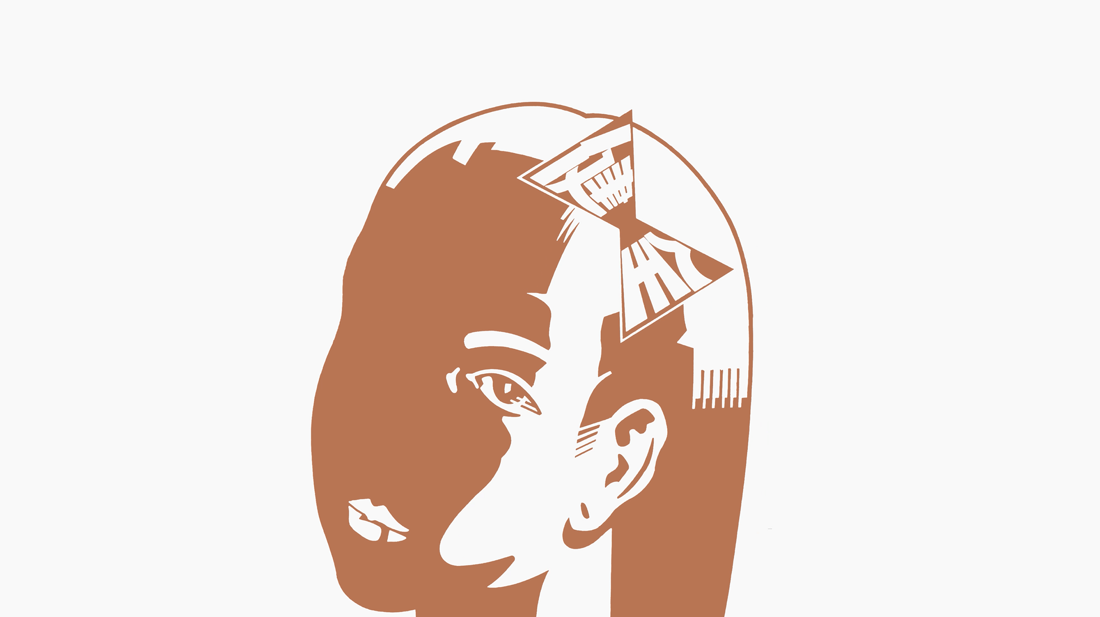
ことばの選び方のセンスが、すごいなと。ダジャレみたいなものもあるんですけど、それが本当にすごい。短いことばなのに、画と組み合わさることで、ことばだけでも画だけでも届かなかったところまで力が及んでいる。内覧会のときに、仲條さんの娘さんからうかがったのですが、仲條さんはことばを紙に書いて貼り出して、デザイン関係の人だけでなく全然違う分野の人にも意見を聞いていたそう。自分は画を張り出して比較したりはするけれど、ことばまでは張り出さない。仲條さんがことばにも同じように向き合っていたと知って、そこが印象に残りました。
広告の場合、ことばが伝わるようにきれいに配置されています。でも仲條さんの場合は、ことばが生きている。コピーとして置かれているというより、画や図柄と同じひとつの要素として組み合わされている。だから「文字と画と」という今回の展示テーマも、すごく腑に落ちます。仲條さんの作品を見ていると、デザインというより、なにかしゃべっている感じがあるんですよね。そこにその人がいる感じがする。それが、すごく魅力的です。
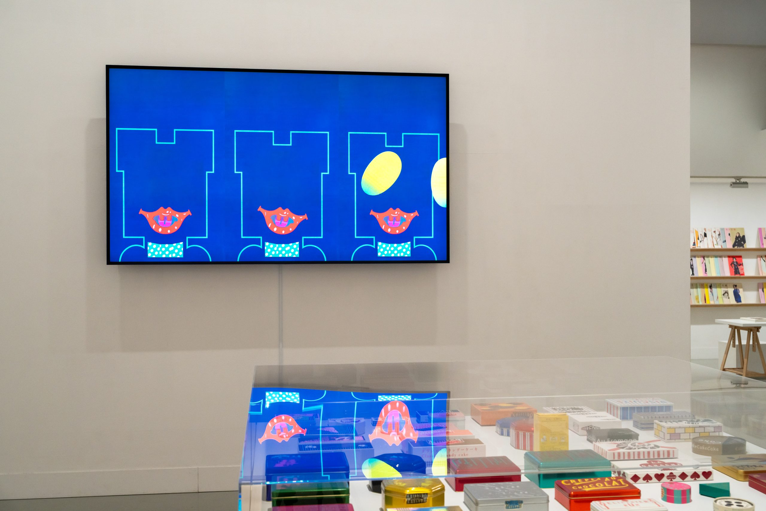
出品作品
※山口崇多氏映像作品より
感情や人生を含めてデザインする
——映像制作を通して、山口さん自身と仲條さんの共通点は感じましたか。
おこがましいですけど・・・(笑)、少しあるのかなと思いました。初期から晩年までの作品を見ていると、一貫性はもちろんあります。でも、すごく一貫性があるタイプではないと思うんです。技法だけ見ても、絵画みたいなときもあれば、すごくアヴァンギャルドでシンプルな図柄のときもある。その時代に流行っていたイラストレーションの感じを、かなり柔軟に取り入れているようにも見える。
それは、単に直感だけではないと思うんです。その時代を生きていること、そのときの悩みや心理状態、自分の人生も含めてデザインしているから、そうなっているのではないかと感じます。もちろん、僕は仲條さんと直接交流があったわけではないので、勝手に感じているだけなのですが。
デザインは社会的な意義のあるものですし、自分と切り離して、第三者がどう見るかを重視するところがある。でも仲條さんのデザインには、自分の正直な部分を表していくことや、自分がどう表現したいのかを素直に出していくことが含まれているように感じます。そこに、アートとデザインの中間的な部分を感じるんです。
僕もその感覚はすごく大事にしています。よく、手描きでやっているから仲條さんと似ている、と言われることがあるのですが、そういうことではないと思っています。手描きかどうかではなく、感情や人生を含めてデザインしているというところに、勝手に共通点を見出せたんですよね。
仲條さんのキャリアを通して作品を見ていると、表現が行ったり来たりしている。それはある意味、すごく勇気がいることだと思います。ひとつのスタイルに定着していくこともできるはずなのに、時代ごとにいろいろなことに挑戦している。そこがすごいと思いますし、自分もそうありたいと思います。
——仲條さんの表現の広さに驚いたということですが、山口さん自身がこれから挑戦したいことはありますか。
今まで取り組んだことのない立体に挑戦したいと思っています。家具とかですね。いま少しずつ始めていて、発表する機会があればいいなと思っています。映像や音楽という異なるジャンルの表現をおこなうようになったのも、その延長にあるのかもしれません。
昔のデザイナーって、肩書きにあまり縛られていない感じがありますよね。グラフィックデザイナーというより、ただ「デザイナー」として、絵本もつくるし、広告も、空間やプロダクトも手がける。そういうあり方には、すごく憧れがあります。仲條さんも、個展で過去の仕事を見せるのではなく、新作を発表していた。デザイナーが個展をするとなると、どうしてもワークスを見せる形になりがちですけど、毎回あたらしい作品をつくって発表する。その姿勢を見習って、作品づくりをしていきたいです。
山口崇多(やまぐち・あがた)
1988年生まれ。東京藝術大学美術学部デザイン科卒 業。10 inc.を経て2021年にcollé(株式会社コル)設立。 明るいグラフィックデザインをモットーに、企業のCI・ VI 開発、ブランディング、パッケージデザイン、サイン 計画、アートワークの提供に取り組む。自社ブランド published by collé では、多岐にわたる分野で表現の 探求を行う。JAGDA新人賞2024受賞。
https://www.colle.co.jp/
https://www.instagram.com/agatayamaguchi_colle/
-
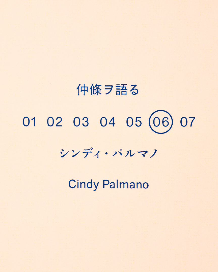
仲條ヲ語る#6 「Thank You for Making the Magazine Better」
Talking about Nakajo #6 "Thank You for Making the Magazine Better"
-
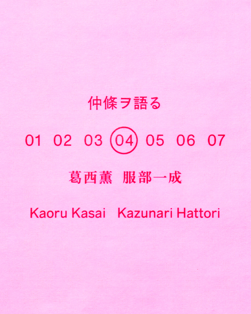
仲條ヲ語る#4 「資生堂が持つ「文化的なイメージ」を つくり上げたのは仲條さんなのかもしれない。」
Talking about Nakajo #4 "Nakajo maybe the one who created the "cultural image" of Shiseido"
-
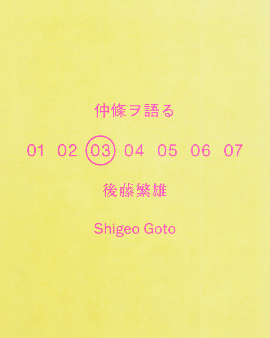
仲條ヲ語る#3 「仲條正義流の「本歌取り」」
Talking about Nakajo #3 "Masayoshi Nakajo’s Art of “Honka-dori”"
-
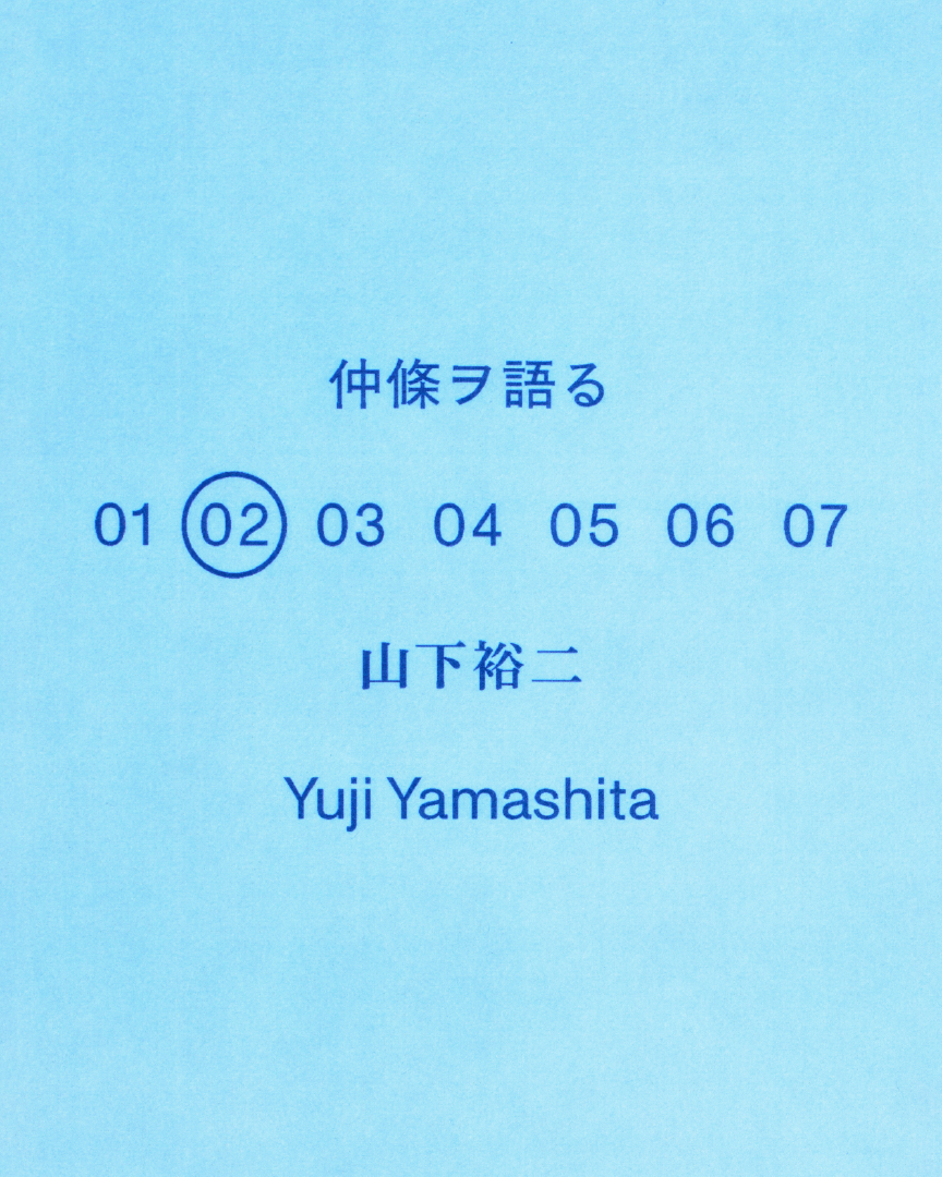
仲條ヲ語る#2 「其ノ、ココロハ 小村雪岱×仲條正義」
Talking about Nakajo #2 "The Spirit Within: Komura Settai × Masayoshi Nakajo"
-
仲條ヲ語る#1 「デザインにも表れる根っからの東京人的気質」
Talking about Nakajo #1 "A fundamentally Tokyoite sensibility—even in design"
Talking about Nakajo #5 “Where Design and Life Overlap”
2026.5.19
In conjunction with the exhibition Nakajo Sings, Nakajo Dances—Letters, Pictures, and Shiseido, currently on view at Shiseido Gallery, the series “Talking about Nakajo” invites people closely connected to Masayoshi Nakajo to reflect on his work and his way of seeing.
The time they spent together, the words they exchanged, memories from the field—through each perspective emerges not only Nakajo as a designer, but Nakajo as a person.
For this fifth instalment, we speak with graphic designer Sota Yamaguchi. For the exhibition, Yamaguchi created a motion graphics video based on the works of Masayoshi Nakajo. Through this first attempt at animating another person’s graphics and illustrations, he reflects on what he discovered about the movement, language, and design of Nakajo’s work.
A story not as narrative, but as a worldview
—When you received the commission for the video, how did the project begin for you?
At first I received an email saying, “Let’s make a video.” Then, as we had more meetings, it gradually became a project to create a video based on Nakajo’s works. I think this was the first time I had taken graphics or illustrations drawn by someone other than myself and used them as material to animate.
At the beginning, I felt quite a lot of pressure. But once I actually started, I didn’t feel as much pressure as I had expected. Maybe I was also trying not to feel it.
I wanted it to be clear that these were Nakajo’s works. At the same time, by unfolding as a video within the flow of time, I hoped it would become a different experience from simply following the works with your eyes. I wanted to find that kind of balance.
—How did you think about the structure of the video?
At first I wondered whether I should structure it by creating a proper story, or whether it would be better to mix together various works. In the end, it was closer to the latter. More like a collage, or like DJing.
Rather than conveying a story as a single narrative, I wanted to convey a story as a worldview. That was the feeling I wanted to value.
So I’d like people to pay attention to the overall sense of mixing and the way the pauses are handled. There are moments where something just a little bit different enters, or where the movement becomes slightly strange. I think there is a subtle sense of dissonance.
There is something in Nakajo’s work that makes people smile. So this time too, rather than simply animating the works in a cool way, I wanted to value the parts that feel somehow funny or mysterious. It feels as if there is meaning, but not necessarily a clear meaning. That sense of “hmm?”—placing it in the work without making it feel deliberate—is something I care about a great deal in my own practice.
—When animating Nakajo’s works, were there parts that came to you intuitively and parts you had to think through?
Most of it came to me almost immediately. Looking at the images, I could naturally see how they might move. Just like the title Nakajo Sings, Nakajo Dances, when you look at them, you can imagine movement. I think that impression comes from Nakajo’s expression itself.
Nakajo’s works often feature motifs of living things—people, animals, flowers. If it’s an aeroplane, it would fly; if it’s an animal, it would move; even a flower has some kind of movement.
Also, rather than being made of multiple layers built up on top of one another, the elements exist within a single picture. Because there are distinct parts, it’s easy to imagine how they might move. I’ve heard that he made works by cutting things out by hand and collaging them, and I feel that quality in his everyday work as well. Each element sits within a single picture plane. So when turning them into video, I could naturally think of them as separate components.
What I struggled with, on the other hand, was the overall structure. I made it fairly calmly, so that each work could be seen more or less equally. But until the very end, I was worried that the whole thing might become too monotonous. Eventually, though, I felt that it was fine for it to end with a sense of, “Oh, it’s already over.”
I don’t think Nakajo’s work is necessarily about dramatic development either. It feels more like he calmly gathered together the things he liked. Hanatsubaki features also feel quite flat, rather than being structured dramatically with a beginning, development, turn, and conclusion. So in the end, I think it was right not to create a climax in the video. Perhaps, unconsciously, that flatness was connected to Nakajo’s work.
Words and pictures living on the same plane
—Nakajo’s words also have a strong presence, don’t they?
His sense for choosing words is incredible. Some of them are almost like puns, but they’re really amazing. Even when the words are short, by combining with the image, they reach somewhere that neither the words nor the image could reach alone.
At the preview, I heard from Nakajo’s daughter that he would write words on pieces of paper, put them up, and ask all kinds of people for their opinions—not only people in design, but people from completely different fields. I sometimes put up images and compare them, but I don’t go as far as putting up words. Learning that Nakajo approached language in the same way left a strong impression on me.
In advertising, words are often arranged beautifully so that they communicate clearly. But in Nakajo’s case, the words are alive. Rather than being placed there as copy, they are combined as one element, just like the picture or the pattern.
That’s why the theme of this exhibition, “Letters and Pictures,” makes so much sense to me. When I look at Nakajo’s work, it feels less like design and more like something speaking. It feels as if the person is there. That is what I find so compelling.
Designing with emotion and life
—Through making the video, did you feel any points of connection between yourself and Nakajo?
It may be presumptuous… (laughs), but I did feel there might be some. Looking at his work from the early period to his later years, there is of course consistency. But I don’t think he was the kind of designer whose work is extremely consistent. In terms of technique alone, sometimes it looks painterly; at other times, the imagery is very avant-garde and simple. He also seems to have flexibly taken in the illustration styles that were current at each moment.
I don’t think that comes only from intuition. I feel it became that way because he was designing while taking in the time he was living through, his worries and psychological state at that moment, and his own life. Of course, I never had direct contact with Nakajo, so this is only my own impression.
People often talk about the difference between design and art. Design has social meaning, and there is a way in which you separate it from yourself and place importance on how a third party will see it. But in Nakajo’s design, I feel there is also the act of expressing something honest within himself, of directly showing how he wanted to express something. That is where I sense something between art and design.
That feeling is also very important to me. People often say I resemble Nakajo because I draw by hand, but I don’t think that’s the point. It isn’t about whether something is hand-drawn or not. Rather, I found a point of connection—again, only on my own terms—in the idea of designing while including emotion and life.
When I look at Nakajo’s career as a whole, his expression moves back and forth. In a sense, I think that takes enormous courage. He could have settled into one style, but instead he continued to try different things in each era. That is what I find so remarkable, and it is how I would like to be too.
—You mentioned being surprised by the breadth of Nakajo’s expression. Is there anything you yourself would like to try next?
I’d like to try making three-dimensional work, something I haven’t really done before. Furniture, for example. I’ve started little by little, and I hope there will be an opportunity to present it. Perhaps the fact that I’ve begun working in different genres, such as video and music, is also part of that.
Designers in the past didn’t seem so bound by titles. Rather than being “graphic designers,” they were simply “designers”: making picture books, doing advertising, working on spaces and products. I really admire that kind of way of being.
Nakajo, too, didn’t use his solo exhibitions to show past work; he presented new work. I think that is truly remarkable. When designers hold exhibitions, they often end up showing their previous works, but he created and presented new pieces each time. I want to learn from that attitude and continue making work.
Agata Yamaguchi
Born in 1988. Graduated from the Department of Design, Faculty of Fine Arts, Tokyo University of the Arts. After working at 10 inc., he founded collé inc. in 2021.
Guided by the motto “bright graphic design,” he works on corporate identity and visual identity development, branding, package design, signage planning, and artwork. Through his own brand, published by collé, he explores expression across a wide range of fields.
Recipient of the JAGDA New Designer Award 2024.
https://www.colle.co.jp/
https://www.instagram.com/agatayamaguchi_colle/